 Lua Lua2017-09-05 00:12
мЎ°нҡҢ: 7,466
추мІң: 6
3D нҒҗлёҢлҘј л§Ңл“Өм–ҙліҙмһҗ!нҒ¬лЎ¬м—җм„ңлҠ” м •мғҒмһ‘лҸҷн•ҳм§Җл§Ң мқөн”ҢмқҖ м•Ҳлҗ©лӢҲлӢӨ! webkit к№Ңм§Җ н•ҳл ӨлӢҲ л„Ҳл¬ҙ ліөмһЎн•ҙм„ң.. ------------------------------------------------------------ ------------------------------------------------------------ CSS кіөл¶Җн•ҙліҙлӢӨк°Җ мқёмһҘм—җ мҚЁлЁ№мқ„ мҲҳ мһҲмқ„кұ° к°ҷм•„м„ң к°Җм ёмҷҖлҙӨмҠөлӢҲлӢӨ. кіјм •мқ„ н•ҳлӮҳн•ҳлӮҳ м„ӨлӘ…н–Ҳкё° л•Ңл¬ём—җ, кІ°кіјл§Ң н•„мҡ”н•ҳмӢ 분л“ӨмқҖ мӯү лӮҙл Өм„ң мөңмў… кІ°кіјл¶Җн„° ліҙмӢңл©ҙ лҗ©лӢҲлӢӨ. мҡ°м„ мЈјмҡ” мҪ”л“ң лӘҮк°ңлҘј лҜёлҰ¬ м„ӨлӘ…н•ҳкІ мҠөлӢҲлӢӨ. transform:rotateX(90deg) к°қмІҙлҘј X축мқ„ кё°мӨҖмңјлЎң 90лҸ„ нҡҢм „мӢңнӮөлӢҲлӢӨ. transform:rotateY(90deg) к°қмІҙлҘј Y축мқ„ кё°мӨҖмңјлЎң 90лҸ„ нҡҢм „мӢңнӮөлӢҲлӢӨ. transform:translate3d(10px,20px,30px) к°қмІҙлҘј X축мңјлЎң 10px, Y축мңјлЎң 20px, Z축мңјлЎң 30px мқҙлҸҷмӢңнӮөлӢҲлӢӨ. transform:rotateX(90deg) translate3d(10px,20px,30px) мң„мқҳ л‘җк°Җм§Җ transformмқ„ лҸҷмӢңм—җ н–үн• л•Ң лқ„м–ҙм“°кё°л§Ң м“°л©ҙ лҗ©лӢҲлӢӨ. perspective:300px 3D к°қмІҙмҷҖ мӢңм җмқҳ кұ°лҰ¬лҘј 300pxлЎң м„Өм •н•©лӢҲлӢӨ. м„ м–ён•ҳм§Җ м•Ҡмңјл©ҙ мӣҗк·јк°җмқҙ лҠҗк»ҙм§Җм§Җ м•Ҡмңјл©° кё°ліёк°’мқҖ м•„л§Ҳ л¬ҙн•ңлҢҖмһ…лӢҲлӢӨ. transform-style:preserve-3d к°қмІҙлҘј transform н• л•Ң 3D нҳ•нғңлЎң transform н•©лӢҲлӢӨ. ----------------------------------------------------------- нҒҗлёҢлҘј л§Ңл“ңл Өл©ҙ 1. нҒҗлёҢмқҳ м—¬м„Ҝ л©ҙкіј 2. к·ё м—¬м„Ҝ л©ҙмңјлЎң кө¬м„ұлҗң нҒҗлёҢ 3. к·ёлҰ¬кі нҒҗлёҢк°Җ мһҲлҠ” кіөк°„ мқҙ н•„мҡ”н•©лӢҲлӢӨ. 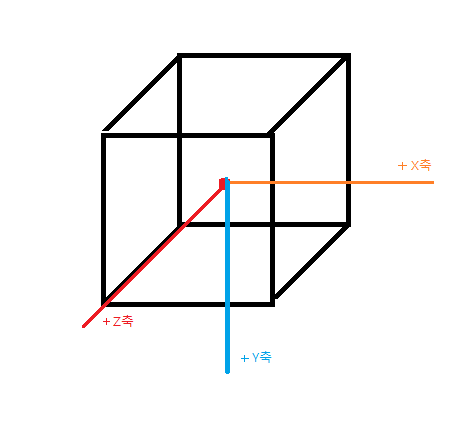 м°ёкі лЎң X,Y,Z 축мқҙ мқҙлӘЁм–‘мһ…лӢҲлӢӨ.. мқҙм ң н•ңліҖмқҳ кёёмқҙк°Җ 100pxмқё нҒҗлёҢлҘј л§Ңл“Өм–ҙліҙкё°м—җ м•һм„ң к°ҖмӢңм„ұмқ„ мң„н•ҙ нҒҗлёҢк°Җ мһҲлҠ” кіөк°„л¶Җн„° л§Ңл“ӨкІ мҠөлӢҲлӢӨ. нҒҗлёҢлҘј мӨ‘мӢ¬м—җ мң„м№ҳн•ҳкІҢ н•ҳкё° мң„н•ҙ <center>лҘј мӮ¬мҡ©н–Ҳкі , 100pxмқҳ кіөл°ұмқ„ м„Өм •н–ҲмҠөлӢҲлӢӨ. мӢңм җ кұ°лҰ¬лҠ” 300pxлЎң м„Өм •н–ҲмҠөлӢҲлӢӨ. ----------------------------------------------------------- <center style="padding-top:100px;width:450px;height:200px;perspective:300px;background-color:#dddddd"></center> ----------------------------------------------------------- ----------------------------------------------------------- мқҙм ң нҒҗлёҢмқҳ м—¬м„Ҝ л©ҙмқ„ л§Ңл“ӨкІ мҠөлӢҲлӢӨ. мҲңм„ңлҢҖлЎң нҒҗлёҢмқҳВ м •л©ҙ, нӣ„л©ҙ, мҳӨлҘёмӘҪл©ҙ,В мҷјмӘҪл©ҙ, мң—л©ҙ, м•„лһ«л©ҙ В мһ…лӢҲлӢӨ. к°ҖмӢңм„ұмқ„ мң„н•ҙ нҲ¬лӘ…лҸ„лҘј 0.7лЎң м„Өм •н•ҳкІ мҠөлӢҲлӢӨ. ----------------------------------------------------------- <center style="padding-top:100px;width:450px;height:200px;perspective:300px;background-color:#dddddd"> <div style="opacity:0.7;width:100;height:100;background-color:#ff0000"></div> <div style="opacity:0.7;width:100;height:100;background-color:#00ff00"></div> <div style="opacity:0.7;width:100;height:100;background-color:#0000ff"></div> <div style="opacity:0.7;width:100;height:100;background-color:#ffff00"></div> <div style="opacity:0.7;width:100;height:100;background-color:#00ffff"></div> <div style="opacity:0.7;width:100;height:100;background-color:#ff00ff"></div> </center> ----------------------------------------------------------- ----------------------------------------------------------- м •л©ҙ мӨ‘мӢ¬мқҳ мң„м№ҳ : (0,0,50) м •л©ҙмқҖ нҡҢм „мӢңнӮ¬ н•„мҡ”к°Җ м—ҶмңјлҜҖлЎң, мӨ‘мӢ¬мңјлЎңл¶Җн„° 50pxл§Ң мҳ®кІЁмЈјл©ҙ лҗ©лӢҲлӢӨ. ----------------------------------------------------------- <center style="padding-top:100px;width:450px;height:200px;perspective:300px;background-color:#dddddd"> <div style="transform:rotateX(0deg) translate3d(0px,0px,50px);opacity:0.7;width:100;height:100;background-color:#ff0000"></div> <div style="opacity:0.7;width:100;height:100;background-color:#00ff00"></div> <div style="opacity:0.7;width:100;height:100;background-color:#0000ff"></div> <div style="opacity:0.7;width:100;height:100;background-color:#ffff00"></div> <div style="opacity:0.7;width:100;height:100;background-color:#00ffff"></div> <div style="opacity:0.7;width:100;height:100;background-color:#ff00ff"></div> </center> ----------------------------------------------------------- ----------------------------------------------------------- мқҙм ңл¶Җн„° кіЁл•ҢлҰ¬лҠ” м җмқҙ л‘җк°ңк°Җ н•ңлІҲм—җ 겹칩лӢҲлӢӨ. мҡ°м„ мқёлІӨмқҖ position:absolute (к°қмІҙмқҳ м ҲлҢҖмң„м№ҳ) лҘј н—Ҳмҡ©н•ҳм§Җ м•Ҡкё° л•Ңл¬ём—җ position:relative (к°қмІҙмқҳ мғҒлҢҖмң„м№ҳ) лҘј мӮ¬мҡ©н•ҙм•ј н•©лӢҲлӢӨ. мҰү л‘җлІҲм§ё л©ҙмқҖ Y축мқ„ -100px, м„ёлІҲм§ё л©ҙмқҖ -200px, л„ӨлІҲм§ё л©ҙмқҖ -300px~~~лҘј мқҙлҸҷмӢңмјңм•ј к°қмІҙк°Җ кІ№міҗ진 мң„м№ҳм—җ мЎҙмһ¬н• мҲҳ мһҲмҠөлӢҲлӢӨ.В л‘җлІҲм§ёлЎң, к°қмІҙлҘј нҡҢм „мӢңнӮӨл©ҙ к°қмІҙмқҳ X,Y,Z 축 лҳҗн•ң нҡҢм „лҗ©лӢҲлӢӨ.. мҰү кІҪмҡ°м—җ л”°лқјм„ң Y축мңјлЎң +100pxлҘј, нҳ№мқҖ Z축мңјлЎң мқҙлҸҷмӢңмјңм•ј к°қмІҙлҘј кІ№м№ҳкІҢ н• мҲҳ мһҲмҠөлӢҲлӢӨ. л”°лқјм„ң нӣ„л©ҙмқҳ мӨ‘мӢ¬мқ„ (0,0,-50) м—җ ліҙлӮҙл Өкі н•ңлӢӨл©ҙ X축мңјлЎң 180лҸ„ нҡҢм „мӢңнӮЁ нӣ„ Y축мңјлЎң +100px, Z축мңјлЎң +50px л§ҢнҒј мқҙлҸҷмӢңнӮӨл©ҙ лҗ©лӢҲлӢӨ. ----------------------------------------------------------- <center style="padding-top:100px;width:450px;height:200px;perspective:300px;background-color:#dddddd"> <div style="transform:rotateX(0deg) translate3d(0px,0px,50px);opacity:0.7;width:100;height:100;background-color:#ff0000"></div> <div style="transform:rotateX(180deg) translate3d(0px,100px,50px);opacity:0.7;width:100;height:100;background-color:#00ff00"></div> <div style="opacity:0.7;width:100;height:100;background-color:#0000ff"></div> <div style="opacity:0.7;width:100;height:100;background-color:#ffff00"></div> <div style="opacity:0.7;width:100;height:100;background-color:#00ffff"></div> <div style="opacity:0.7;width:100;height:100;background-color:#ff00ff"></div> </center> ----------------------------------------------------------- ----------------------------------------------------------- мҳӨлҘёмӘҪл©ҙмқҳ мӨ‘мӢ¬мқ„ (50,0,0) м—җ ліҙлӮҙл Өл©ҙ Y축 кё°мӨҖмңјлЎң +90лҸ„ нҡҢм „мӢңнӮЁ нӣ„ Y축мңјлЎң -200px, Z축мңјлЎң 50px мқҙлҸҷмӢңнӮӨл©ҙ лҗ©лӢҲлӢӨ. ----------------------------------------------------------- <center style="padding-top:100px;width:450px;height:200px;perspective:300px;background-color:#dddddd"> <div style="transform:rotateX(0deg) translate3d(0px,0px,50px);opacity:0.7;width:100;height:100;background-color:#ff0000"></div> <div style="transform:rotateX(180deg) translate3d(0px,100px,50px);opacity:0.7;width:100;height:100;background-color:#00ff00"></div> <div style="transform:rotateY(90deg) translate3d(0px,-200px,50px);opacity:0.7;width:100;height:100;background-color:#0000ff"></div> <div style="opacity:0.7;width:100;height:100;background-color:#ffff00"></div> <div style="opacity:0.7;width:100;height:100;background-color:#00ffff"></div> <div style="opacity:0.7;width:100;height:100;background-color:#ff00ff"></div> </center> ----------------------------------------------------------- ----------------------------------------------------------- мҷјмӘҪл©ҙмқҳ мӨ‘мӢ¬мқ„ (-50,0,0) м—җ ліҙлӮҙл Өл©ҙ Y축 кё°мӨҖмңјлЎң -90лҸ„ нҡҢм „мӢңнӮӨкі Y축мңјлЎң -300px, Z축мңјлЎң 50px мқҙлҸҷмӢңнӮӨл©ҙ лҗ©лӢҲлӢӨ. ----------------------------------------------------------- <center style="padding-top:100px;width:450px;height:200px;perspective:300px;background-color:#dddddd"> <div style="transform:rotateX(0deg) translate3d(0px,0px,50px);opacity:0.7;width:100;height:100;background-color:#ff0000"></div> <div style="transform:rotateX(180deg) translate3d(0px,100px,50px);opacity:0.7;width:100;height:100;background-color:#00ff00"></div> <div style="transform:rotateY(90deg) translate3d(0px,-200px,50px);opacity:0.7;width:100;height:100;background-color:#0000ff"></div> <div style="transform:rotateY(-90deg) translate3d(0px,-300px,50px);opacity:0.7;width:100;height:100;background-color:#ffff00"></div> <div style="opacity:0.7;width:100;height:100;background-color:#00ffff"></div> <div style="opacity:0.7;width:100;height:100;background-color:#ff00ff"></div> </center> ----------------------------------------------------------- ----------------------------------------------------------- мң—л©ҙмқҳ мӨ‘мӢ¬мқ„ (0,-50,0) мңјлЎң ліҙлӮҙл Өл©ҙ X축мңјлЎң 90лҸ„ нҡҢм „мӢңнӮЁ нӣ„ Z축мңјлЎң 450px мқҙлҸҷмӢңнӮӨл©ҙ лҗ©лӢҲлӢӨ. (400 + 50px) ----------------------------------------------------------- <center style="padding-top:100px;width:450px;height:200px;perspective:300px;background-color:#dddddd"> <div style="transform:rotateX(0deg) translate3d(0px,0px,50px);opacity:0.7;width:100;height:100;background-color:#ff0000"></div> <div style="transform:rotateX(180deg) translate3d(0px,100px,50px);opacity:0.7;width:100;height:100;background-color:#00ff00"></div> <div style="transform:rotateY(90deg) translate3d(0px,-200px,50px);opacity:0.7;width:100;height:100;background-color:#0000ff"></div> <div style="transform:rotateY(-90deg) translate3d(0px,-300px,50px);opacity:0.7;width:100;height:100;background-color:#ffff00"></div> <div style="transform:rotateX(90deg) translate3d(0px,0px,450px);opacity:0.7;width:100;height:100;background-color:#00ffff"></div> <div style="opacity:0.7;width:100;height:100;background-color:#ff00ff"></div> </center> ----------------------------------------------------------- ----------------------------------------------------------- л§Ҳм§Җл§үмңјлЎң м•„лһ«л©ҙмқ„ (0,50,0) лЎң мқҙлҸҷмӢңнӮӨл Өл©ҙ X축мңјлЎң -90лҸ„ нҡҢм „мӢңнӮӨкі Z축мңјлЎң -450px мқҙлҸҷмӢңнӮӨл©ҙ лҗ©лӢҲлӢӨ. (-500 + 50px) ----------------------------------------------------------- <center style="padding-top:100px;width:450px;height:200px;perspective:300px;background-color:#dddddd"> <div style="transform:rotateX(0deg) translate3d(0px,0px,50px);opacity:0.7;width:100;height:100;background-color:#ff0000"></div> <div style="transform:rotateX(180deg) translate3d(0px,100px,50px);opacity:0.7;width:100;height:100;background-color:#00ff00"></div> <div style="transform:rotateY(90deg) translate3d(0px,-200px,50px);opacity:0.7;width:100;height:100;background-color:#0000ff"></div> <div style="transform:rotateY(-90deg) translate3d(0px,-300px,50px);opacity:0.7;width:100;height:100;background-color:#ffff00"></div> <div style="transform:rotateX(90deg) translate3d(0px,0px,450px);opacity:0.7;width:100;height:100;background-color:#00ffff"></div> <div style="transform:rotateX(-90deg) translate3d(0px,0px,-450px);opacity:0.7;width:100;height:100;background-color:#ff00ff"></div> </center> ----------------------------------------------------------- ----------------------------------------------------------- мқҙм ң нҒҗлёҢ мһҗмІҙлҠ” мҷ„м„ұмқҙ лҗҳм—Ҳм§Җл§Ң, 3DлЎң мқёмӢқлҗҳм§Җ м•Ҡм•ҳлӢӨ ліҙлӢҲ мҳҒ 3Dк°ҷм•„ліҙмқҙм§Җ м•ҠмЈ . мқҙм ң м—¬м„Ҝк°ңмқҳ л©ҙмқ„ 묶мқҖ "cube" к°қмІҙлҘј л§Ңл“Өкі transform-style:preserve-3d лҘј м„ м–ён•ҙм„ң 3Dнҷ” мӢңнӮөлӢҲлӢӨ. мөңмў…кІ°кіј ----------------------------------------------------------- <center style="padding-top:100px;width:450px;height:200px;perspective:300px;background-color:#dddddd"> <div data-inven-id="cube" style="width:100px;height:100px;transform-style:preserve-3d;"> <div style="transform:rotateX(0deg) translate3d(0px,0px,50px);opacity:0.7;width:100;height:100;background-color:#ff0000"></div> <div style="transform:rotateX(180deg) translate3d(0px,100px,50px);opacity:0.7;width:100;height:100;background-color:#00ff00"></div> <div style="transform:rotateY(90deg) translate3d(0px,-200px,50px);opacity:0.7;width:100;height:100;background-color:#0000ff"></div> <div style="transform:rotateY(-90deg) translate3d(0px,-300px,50px);opacity:0.7;width:100;height:100;background-color:#ffff00"></div> <div style="transform:rotateX(90deg) translate3d(0px,0px,450px);opacity:0.7;width:100;height:100;background-color:#00ffff"></div> <div style="transform:rotateX(-90deg) translate3d(0px,0px,-450px);opacity:0.7;width:100;height:100;background-color:#ff00ff"></div> </div> </center> ----------------------------------------------------------- ----------------------------------------------------------- м§ңмһ”! мҷ„м„ұмһ…лӢҲлӢӨ. мқҙм ң нҒҗлёҢлҘј мқҙлҸҷн•ҳкұ°лӮҳ нҡҢм „мӢңнӮ¬ л•Ң "cube" м—җм„ңл§Ң мҪ”л“ңлҘј мһ…л Ҙн•ҙлҸ„ лҗ©лӢҲлӢӨ. мҳҲлҘј л“Өм–ҙ мң„м№ҳлҘј мқҙлҸҷн•ҳкұ°лӮҳ ----------------------------------------------------------- <center style="padding-top:100px;width:450px;height:200px;perspective:300px;background-color:#dddddd"> <div data-inven-id="cube" style="width:100px;height:100px;transform-style:preserve-3d;transform:translate3d(100px,-30px,0px)"> <div style="transform:rotateX(0deg) translate3d(0px,0px,50px);opacity:0.7;width:100;height:100;background-color:#ff0000"></div> <div style="transform:rotateX(180deg) translate3d(0px,100px,50px);opacity:0.7;width:100;height:100;background-color:#00ff00"></div> <div style="transform:rotateY(90deg) translate3d(0px,-200px,50px);opacity:0.7;width:100;height:100;background-color:#0000ff"></div> <div style="transform:rotateY(-90deg) translate3d(0px,-300px,50px);opacity:0.7;width:100;height:100;background-color:#ffff00"></div> <div style="transform:rotateX(90deg) translate3d(0px,0px,450px);opacity:0.7;width:100;height:100;background-color:#00ffff"></div> <div style="transform:rotateX(-90deg) translate3d(0px,0px,-450px);opacity:0.7;width:100;height:100;background-color:#ff00ff"></div> </div> </center> ----------------------------------------------------------- ----------------------------------------------------------- м•„лһҳмІҳлҹј нҡҢм „мӢңмјңл‘җкұ°лӮҳ ----------------------------------------------------------- <center style="padding-top:100px;width:450px;height:200px;perspective:300px;background-color:#dddddd"> <div data-inven-id="cube" style="width:100px;height:100px;transform-style:preserve-3d;transform:rotate3d(0.3,0.5,0.4,175deg)"> <div style="transform:rotateX(0deg) translate3d(0px,0px,50px);opacity:0.7;width:100;height:100;background-color:#ff0000"></div> <div style="transform:rotateX(180deg) translate3d(0px,100px,50px);opacity:0.7;width:100;height:100;background-color:#00ff00"></div> <div style="transform:rotateY(90deg) translate3d(0px,-200px,50px);opacity:0.7;width:100;height:100;background-color:#0000ff"></div> <div style="transform:rotateY(-90deg) translate3d(0px,-300px,50px);opacity:0.7;width:100;height:100;background-color:#ffff00"></div> <div style="transform:rotateX(90deg) translate3d(0px,0px,450px);opacity:0.7;width:100;height:100;background-color:#00ffff"></div> <div style="transform:rotateX(-90deg) translate3d(0px,0px,-450px);opacity:0.7;width:100;height:100;background-color:#ff00ff"></div> </div> </center> ----------------------------------------------------------- ----------------------------------------------------------- нҒҙлҰӯн•ҳл©ҙ нҡҢм „н•ҳлҠ” лІ„нҠјмқ„ л§Ңл“ лӢӨлҚҳк°Җ н• мҲҳ мһҲмҠөлӢҲлӢӨ. ----------------------------------------------------------- <center style="padding-top:100px;width:450px;height:200px;perspective:300px;background-color:#dddddd"> <div data-inven-id="cube1" style="width:100px;height:100px;transform-style:preserve-3d;transition:1.5s"> <div style="transform:rotateX(0deg) translate3d(0px,0px,50px);opacity:0.7;width:100;height:100;background-color:#ff0000"></div> <div style="transform:rotateX(180deg) translate3d(0px,100px,50px);opacity:0.7;width:100;height:100;background-color:#00ff00"></div> <div style="transform:rotateY(90deg) translate3d(0px,-200px,50px);opacity:0.7;width:100;height:100;background-color:#0000ff"></div> <div style="transform:rotateY(-90deg) translate3d(0px,-300px,50px);opacity:0.7;width:100;height:100;background-color:#ffff00"></div> <div style="transform:rotateX(90deg) translate3d(0px,0px,450px);opacity:0.7;width:100;height:100;background-color:#00ffff"></div> <div style="transform:rotateX(-90deg) translate3d(0px,0px,-450px);opacity:0.7;width:100;height:100;background-color:#ff00ff"></div> </div> </center> <a href="#" data-inven-click-css="{'cube1':[{'transform':'rotate3d(0.3,0.7,0.5,360deg)'},{'transform':'rotate3d(0,0,0,0deg)'}]}">н•ңл°”нҖҙ нҡҢм „</a><br> <a href="#" data-inven-click-css="{'cube1':[{'transform':'rotate3d(0,1,0,7200deg)'},{'transform':'rotate3d(0,0,0,0deg)'}]}">л№ҷк·ёлҘҙлҘҙлҘҙ</a><br> <a href="#" data-inven-click-css="{'cube1':[{'transform':'translate3d(-100px,0px,0px)'},{'transform':'translate3d(100px,0px,0px)'},{'transform':'translate3d(0px,0px,0px)'}]}">мўҢ мҡ°лЎң мқҙлҸҷ</a> ----------------------------------------------------------- л№ҷк·ёлҘҙлҘҙлҘҙ мўҢ мҡ°лЎң мқҙлҸҷ ----------------------------------------------------------- лӢӨл§Ң "лІ„нҠјмқ„ н•ңлІҲ нҒҙлҰӯн• л•Ң л§ҲлӢӨ лӘҮлҸ„м”© нҡҢм „" нҳ№мқҖ "мқҙлҸҷмӢңнӮЁ к°қмІҙлҘј нҡҢм „"к°ҷмқҖкұҙ кө¬нҳ„н•ҳкё° нһҳл“Ө л“Ҝ(к°ҖлҠҘмқҖ н•Ё) л§Ҳм§Җл§үмңјлЎң нҒҗлёҢмқҳ к°Ғ л©ҙ м•Ҳм—җ кёҖмқҙлӮҳ мӮ¬м§„мқ„ 집м–ҙл„Јмқ„ мҲҳлҸ„ мһҲмҠөлӢҲлӢӨ. ----------------------------------------------------------- <center style="padding-top:100px;width:450px;height:200px;perspective:300px;background-color:#dddddd"> <divВ data-inven-id="cube2"В style="width:100px;height:100px;transform-style:preserve-3d;transition:1.5s"> <div style="transform:rotateX(0deg) translate3d(0px,0px,50px);opacity:0.7;width:100;height:100;background-color:#ff0000">к°ҖлӮҳлӢӨлқјл§Ҳл°”</div> <div style="transform:rotateX(180deg) translate3d(0px,100px,50px);opacity:0.7;width:100;height:100;background-color:#00ff00"><img src="https://upload2.inven.co.kr/upload/2017/08/22/bbs/i16631405531.jpg"></div> <div style="transform:rotateY(90deg) translate3d(0px,-200px,50px);opacity:0.7;width:100;height:100;background-color:#0000ff"></div> <div style="transform:rotateY(-90deg) translate3d(0px,-300px,50px);opacity:0.7;width:100;height:100;background-color:#ffff00"></div> <div style="transform:rotateX(90deg) translate3d(0px,0px,450px);opacity:0.7;width:100;height:100;background-color:#00ffff"></div> <div style="transform:rotateX(-90deg) translate3d(0px,0px,-450px);opacity:0.7;width:100;height:100;background-color:#ff00ff"></div> </div> </center> <a href="#" data-inven-click-css="{'cube2':[{'transform':'rotate3d(1,0,0,180deg)'},{'transform':'rotate3d(0,0,0,0deg)'}]}">л°ҳл°”нҖҙ нҡҢм „</a><br> ----------------------------------------------------------- к°ҖлӮҳлӢӨлқјл§Ҳл°”  ----------------------------------------------------------- мқҙ кёҖм—җм„ к°„лӢЁн•ҳкІҢ 3D нҒҗлёҢл§Ң л§Ңл“Өм–ҙ ліҙм•ҳм§Җл§Ң лӢӨлҘё лӘЁм–‘мңјлЎңлҸ„ м–јл§Ҳл“ м§Җ л§Ңл“Ө мҲҳ мһҲмҠөлӢҲлӢӨ. кёҙ кёҖ мқҪм–ҙмЈјм…”м„ң к°җмӮ¬н•©лӢҲлӢӨ.
EXP
288,074
(12%)
/ 310,001
жңҲд»Ј еҪ© h EVERYTHING    JyA Me I Won't Miss You Anymore (1.1x) Follow.Me  жңҲд»Ј еҪ© Illumi AD : PIANO IV Monochrome  жңҲд»Ј еҪ© Wonderful Dots AD : Electronic Dance 2  Massive New Krew UN1TE (feat. YUC'e) (2016 Edit) Massive CircleZ BEST  Ryo Arue Higurashi AD : PIANO VIVACE  WHITEFISTS Rena Natalia:Code  йӣЁжјҸгӮҠP Rubato AD : PIANO IV Monochrome C-Show Merry Go Round (feat.гӮӨгӮ·гӮ¶гғҜгғҰгӮ«гғӘ) Honey Cheeks -Girlish House compilation album-  ginkiha nightfall (full ver) Ne/nuit 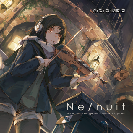 Jeff Williams All Our Days (feat. Casey Lee Williams) RWBY Volume 2 (Original Soundtrack & Score)  UjicoпјҠ Smile! Sweety Sweety  Ray ebb and flow (tamame's 5 years after remix) еҮӘгҒ®гҒӮгҒҷгҒӢгӮү  зҫҺжӯҢ Stellar Flower Increase Beat 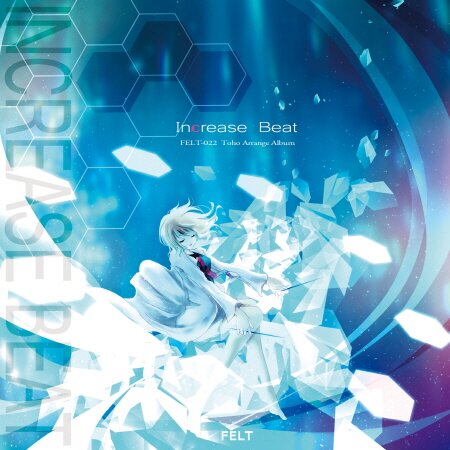 UjicoпјҠ Sight з©әдёӯйғҪеёӮ 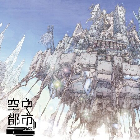 cosMo@жҡҙиө° О©ОәОөОұОҪОҝПӮ AD : PIANO III  m-flo Yours only, (feat.WISEиҘҝйҮҺгӮ«гғҠ) m-flo TRIBUTE~maison de m-flo  M2U еӨңжҳҺгҒ‘гҒ®жӯҢ (feat.гғҖгӮәгғ“гғј) Diversity  C-Show Wanderland (C-Show Remix) жҳҹз©әгғҜгғігғҖгғјгғ©гғігғү  гҒұгҒӘгҒҫгӮ“ glow I am a PEN.  гҒЁгӮ“гҒӢгҒӨгҒәгӮ“гҒҺгӮ“ (гҒҫгӮӮгӮӮ Г— nayuta) жҳҹи© гҒҝ гӮҜгғӯгғӢгӮҜгғ«  DJ Genki (feat. yukacco) Starlit Sky Starry Orange  nano Remember, My Friend N  M2U зҙ„жқҹд№ӢжӯҢ (feat.Sherie) Diversity yuiko жқұгҒ®з©әгҒӢгӮүе§ӢгҒҫгӮӢдё–з•Ң SHUTTER*GIRL                           лҚ”лҸҲлӢӨлҸҲлӢӨм‘қлҸҲлӢӨ 17.07.28  17.06.19 мҷ„м„ұ нҶ нӮӨ LIVE2D |
 Lua
Lua 


|
|